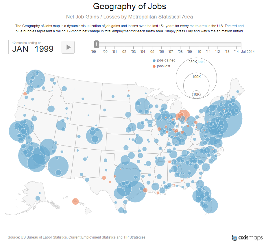
We hope you will take a moment to check out our “new and improved” Geography of Jobs. In our updated version, we’ve included 372 metros* and extended the timeline back to 1999. As in the previous version, each bubble shows the net change in employment in a given metro area compared to the same period one year earlier. The diameter of each bubble reflects the size of the loss or gain. But, unlike the original Geography of Jobs, you can now place your cursor over any of the metros and watch the actual job numbers change over time . If you press the pause button, you can also move your cursor over any metro and compare actual job losses or gains at any point in the timeline. Another “behind the scenes” feature is our ability to map new datasets, such as job change by sector.
At TIP Strategies, we are always looking for ways to translate data into insights about economic development. We hope you will help us with this task by providing feedback and sharing your insights at the end of this blog post.
Map highlights:
- The Great Recession officially lasted from December 2007 to June 2009, but the job losses spanned a longer timeframe, beginning early in 2007 and extending well into 2010. Some regions were hit harder than others, some were hit earlier, and some took longer to recover, but no corner of the US was spared.
- The Dot-Com Bubble was marked by rapid job growth in some of the country’s leading high-tech regions (Silicon Valley, Boston, Seattle, Austin) in 1999 and 2000. You can then see these same regions losing lots of jobs from 2001 to 2003 during the Dot-Com bust and subsequent recession. Silicon Valley actually continued losing jobs into 2004, even while the rest of the country had come out of the recession and was gaining jobs.
- The Housing Bubble, following the relatively mild recession that began in 2001, led to unprecedented job growth across the country. Buoyed by easy money (i.e., subprime mortgages), housing supported strong job growth in places like Las Vegas, Phoenix, Atlanta, and Southern Florida. You will also see that these same places were the first to begin losing jobs as the housing market collapsed, starting in 2007.
- Hurricane Katrina slammed into New Orleans in late July 2005, a disaster that had an immediate and lingering impact on jobs in the region. However, you will notice that metros in the periphery, most notably Baton Rouge, actually saw a significant uptick in jobs during that time due to temporary (and perhaps permanent for many) outmigration from New Orleans.Watching the Midwestern US, especially the manufacturing-centric states of Michigan, Ohio, and Indiana, reveals that many of the metro areas in these states never enjoyed the economic growth experienced by most of the country from 2003 to 2006. Red bubbles cover much of the area surrounding Detroit from 2002 all the way until the end of the Great Recession in 2010. However, the employment situation in the Midwest has taken a turn for the better in recent years thanks to the recovery of the US automotive industry beginning in 2010.
- We are excited about the upgrades to the Geography of Jobs and hope you find it useful. And we would love to hear from you. Please take a moment to share your comments on how the tool did (or did not) provide any insights about your community, any regional or national trends of significance, and other datasets we should consider mapping.
Thanks for viewing.
*NOTE: Map includes the 372 MSAs for which data are available from the US Bureau of Labor Statistics.