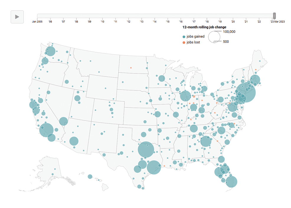
Geography of Jobs
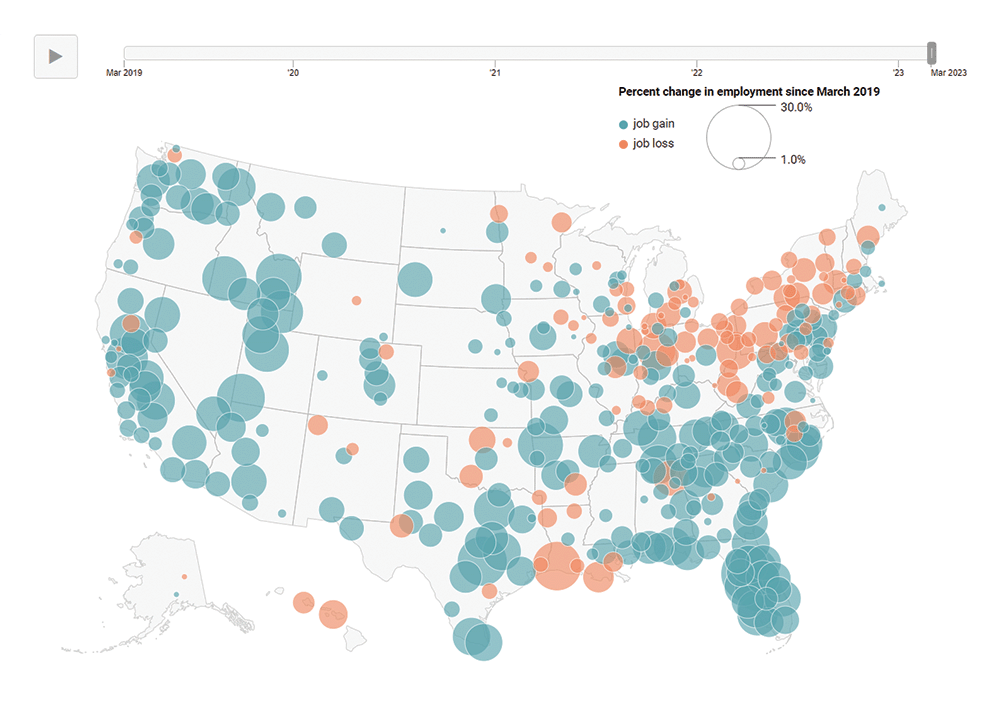
Geography of Recovery
Mapping Local Search Trends
Allocating Limited Resources
Rightsizing Sports Markets
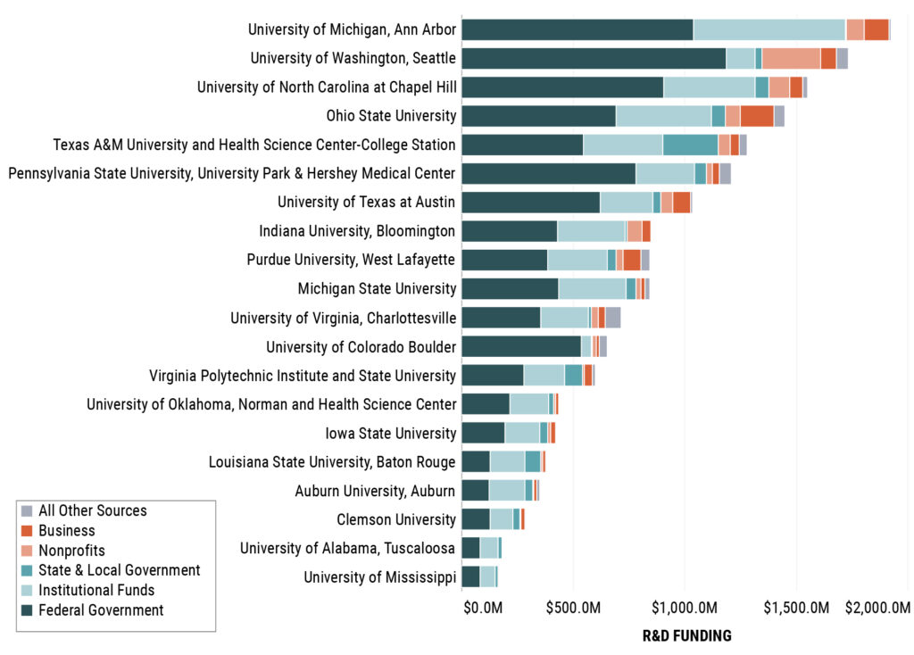
Comparing R&D Funding
Federal funding for academic R&D has become closely scrutinized. Explore the extent to which selected US public flagship universities and their land grant counterparts rely on federal funding.
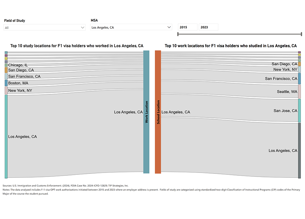
Tracing F1 Visa Journeys
International students play a vital role in strengthening economies by contributing to local industries, culture, and the workforce through the F-1 visa and OPT program. Cities that invest in attracting students and developing educational infrastructure are well-positioned for long-term benefits.
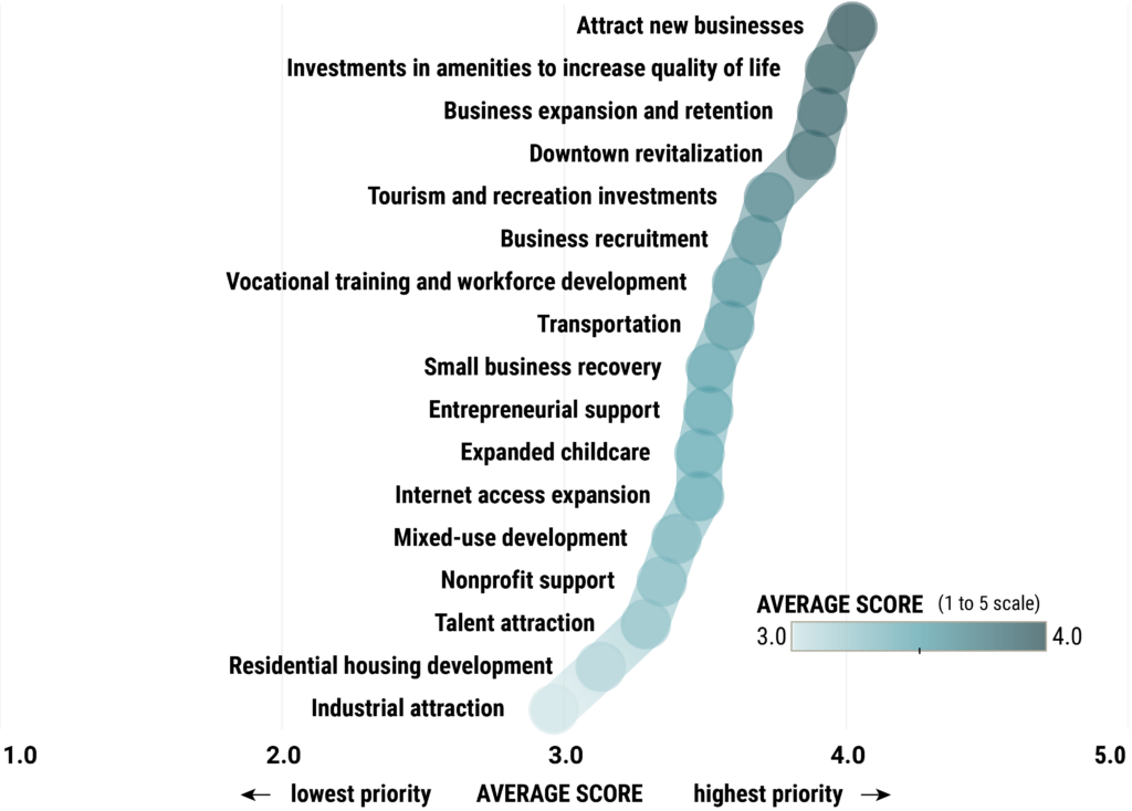
Setting Priorities
Community outreach surveys engage stakeholders in the process of prioritizing local policies. Crosstab filtering is used to monitor nuances across local constituencies. This anonymized example was excerpted from a 2024 survey for a US county government.
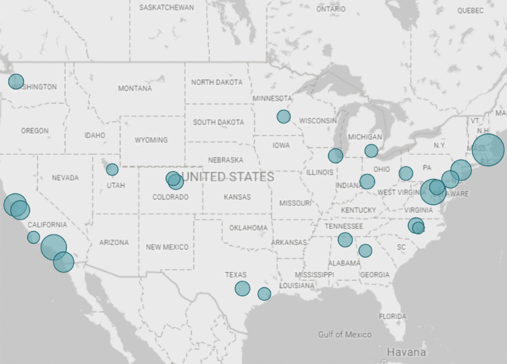
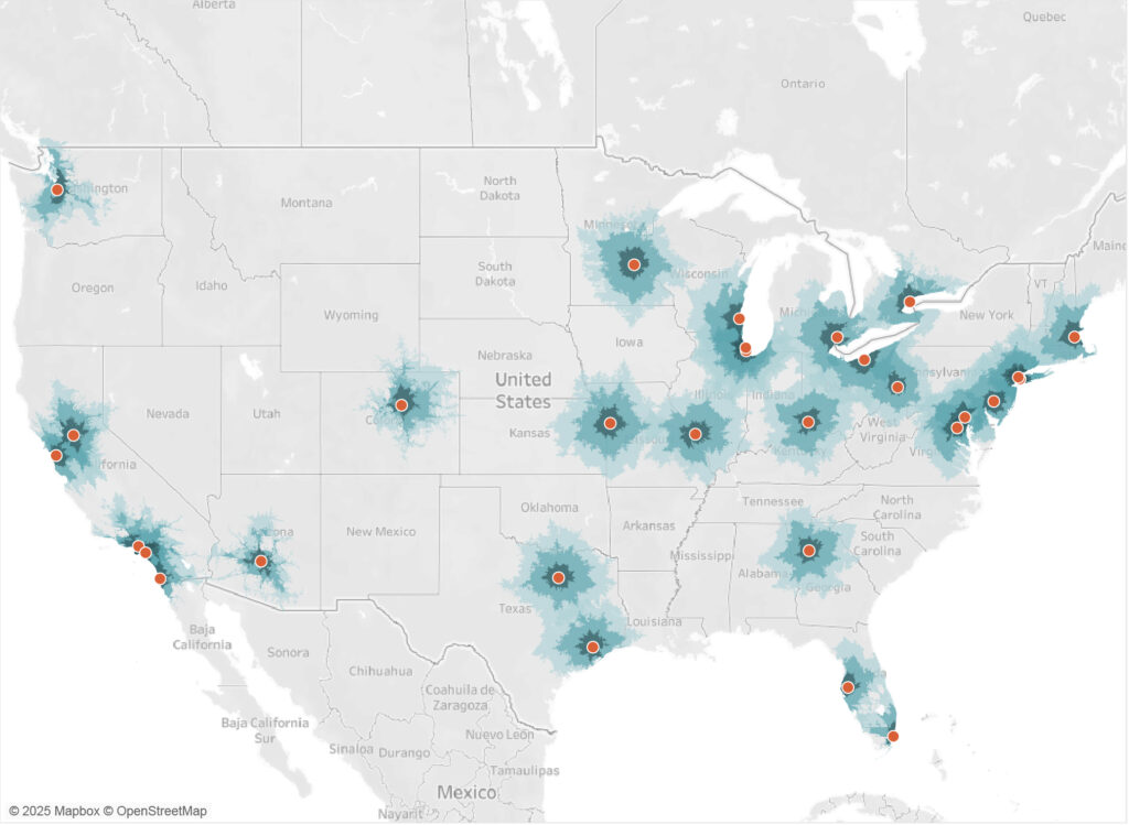
Mapping SBIR/STTR Awards
SBIR/STTR awards highlight innovation clusters near research universities and defense hubs that drive investment in sectors like health, defense, and energy. Cities like Durham, NC; Ann Arbor, MI; Boulder, CO; and Lebanon, NH attract considerable health and defense investment, while Washington, DC; Dayton, OH; and Huntsville, AL excel in defense.
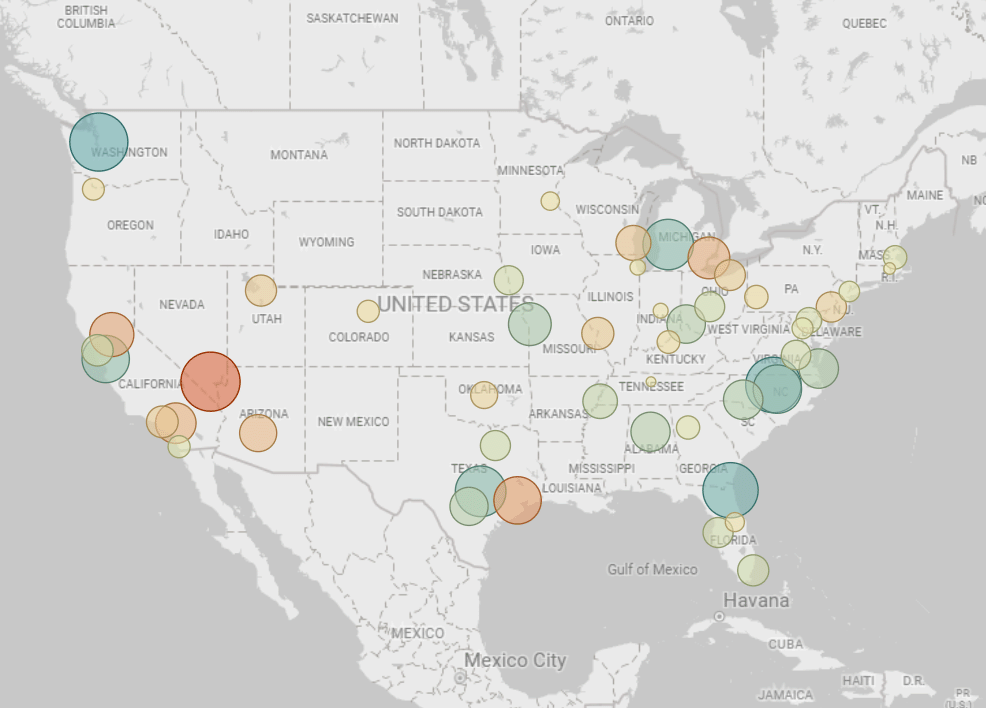
Mapping STEM Pay Growth
STEM wages are rising with inflation in tech hubs like Seattle and Austin and in mid-sized cities, especially in the South, while STEM wages in some Southwest cities have not kept pace with inflation. Non-STEM wages are more stable with the highest increases in more expensive cities.
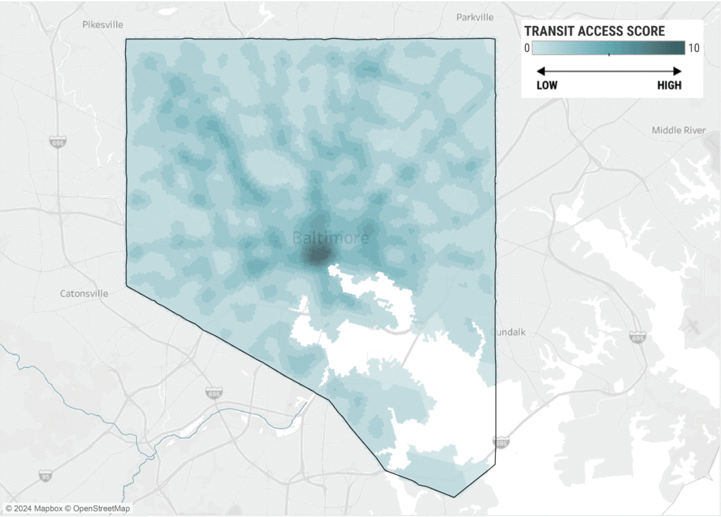
Scoring Transit Access
This map is a component of a larger tool for comparing transit access to demand. It was developed through TIP’s work with the Greater Baltimore Committee (GBC) in 2024.
Measuring Climate Risk
Data from the US Federal Emergency Management Agency (FEMA) can be used to assess potential financial losses, social vulnerability, and community resilience at the state level (and locally, too).
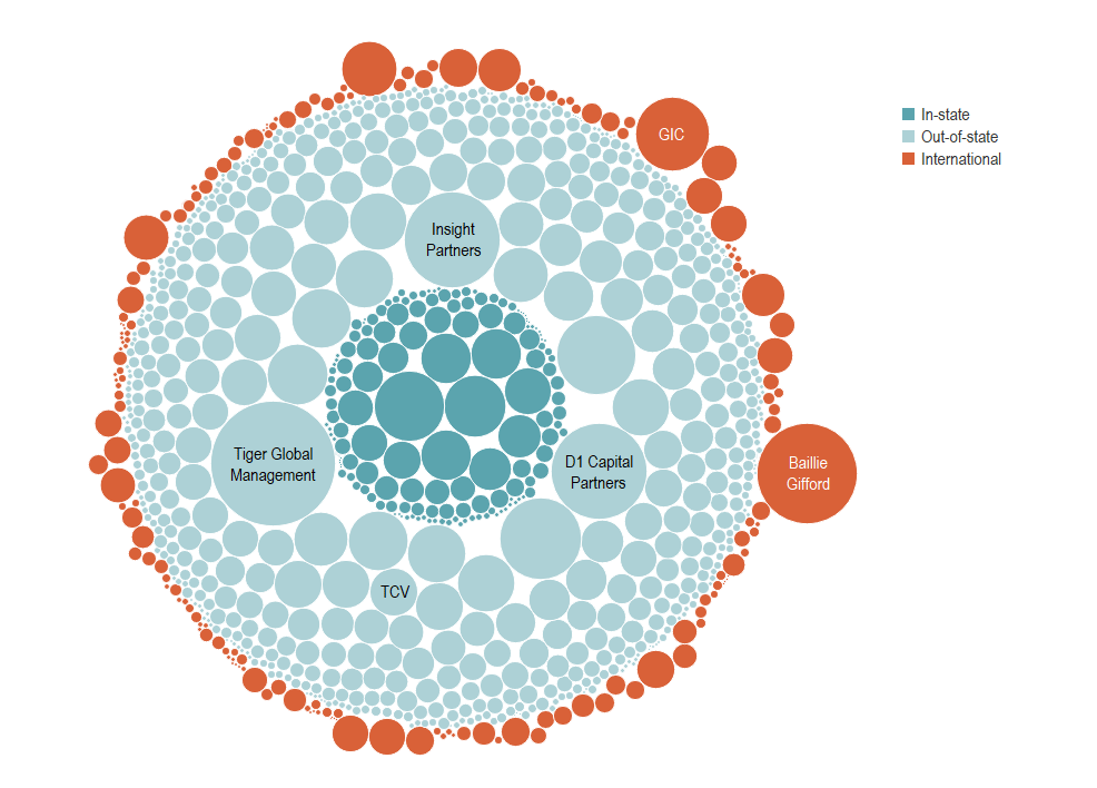
Monitoring VC Investment
How many venture capital (VC) investors are active in the Texas market? Where are they from? How much have they invested? We used Crunchbase data to find out.
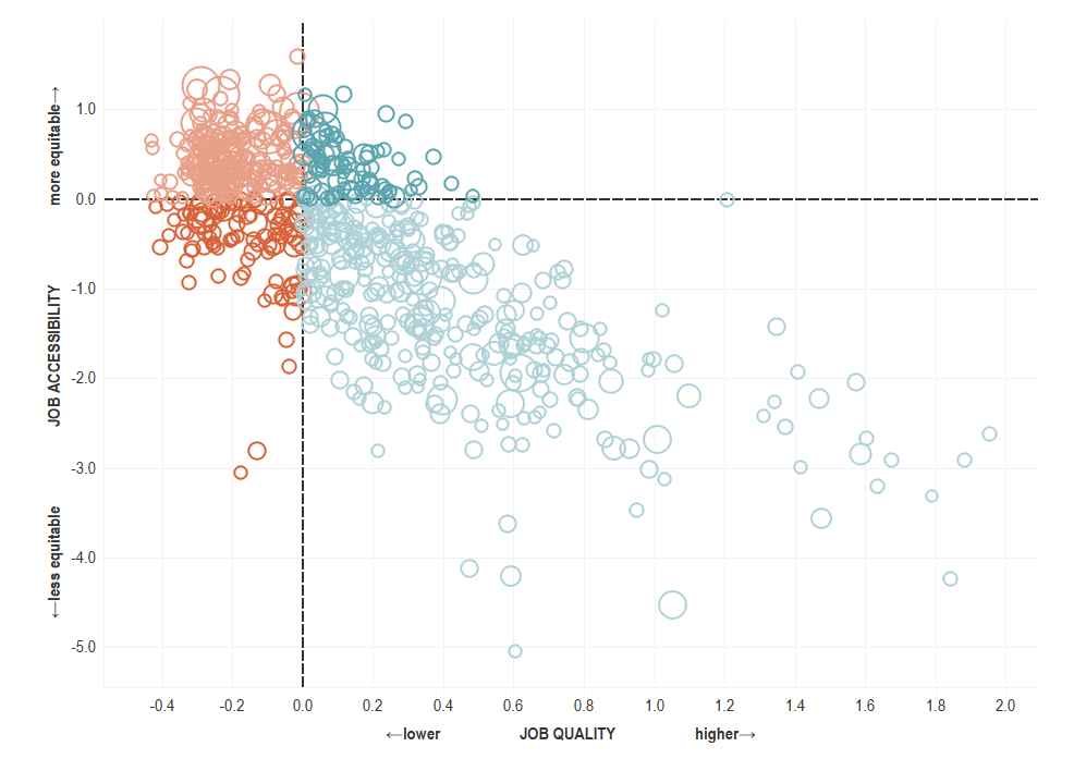
Assessing Job Equity
This tool for measuring job quality and accessibility emerged as part of a larger industry analysis project with the Chicago Metropolitan Agency for Planning (CMAP) in 2021.
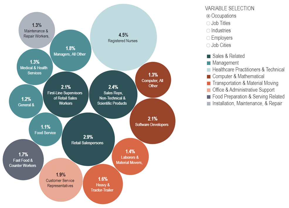
Disaggregating US Job Postings
For this analysis, TIP focuses on national job postings activity from March 2022 to March 2023. Users can examine the top 15 in-demand positions in the US by occupation, job title, employer, and location.
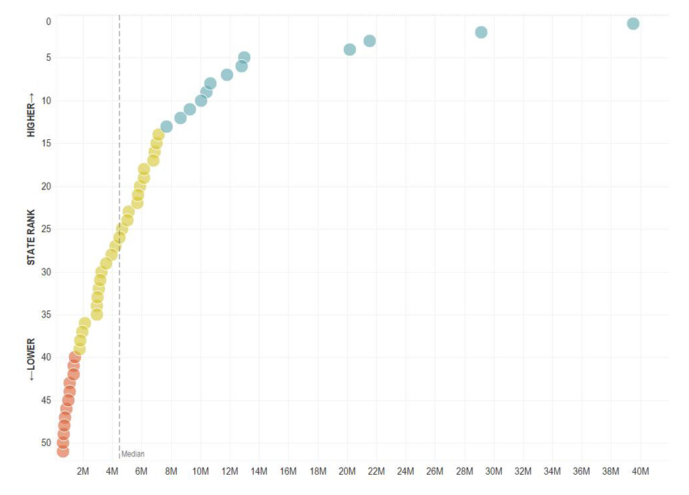
Adding Depth to Rankings
TIP’s data analytics team has developed a tool to make state rankings more useful by adding a simple dispersion factor to the visualization.
Tracking Air Freight
Data from the US Bureau of Transportation Statistics (BTS) can be used to map air freight trends. This is an example of air freight traffic passing through Anchorage, Alaska.
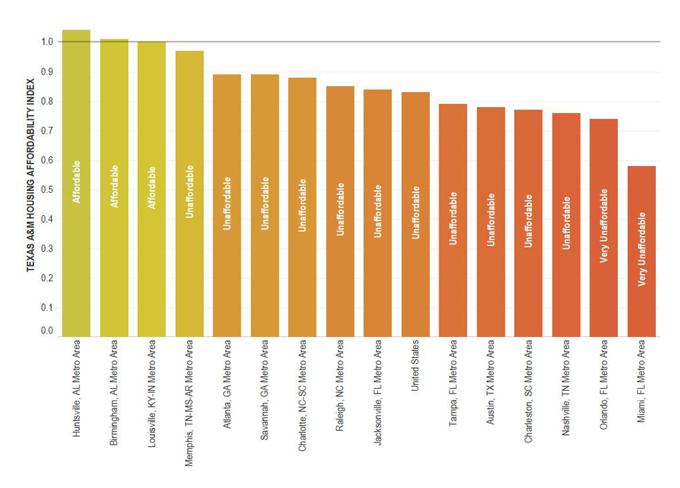
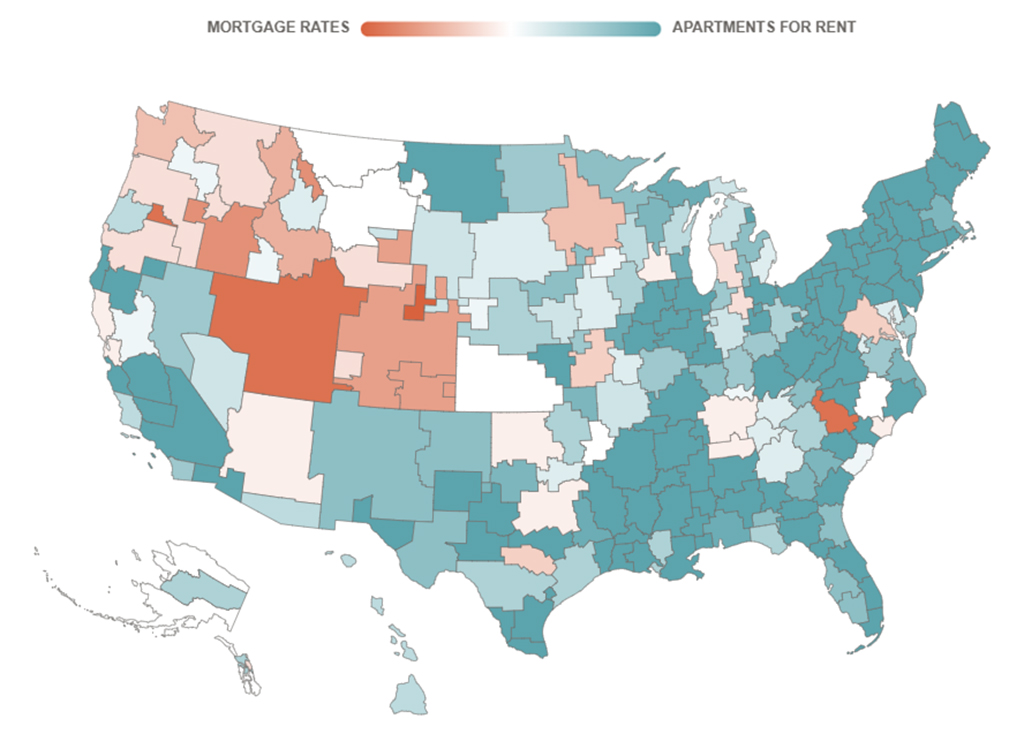
Comparing Housing Costs
An index developed by Texas A&M University’s Real Estate Center can be applied to housing markets across the US. This is an example using selected US metropolitan markets.